• Brand Guidelines
CLIENT
Times Higher Education
SERVICES
BRAND GUIDELINES
COLOUR PALETTE
THE Brand Guidelines
Refining brand identity and ensuring visual cohesion through updated guidelines and a signature gradient.
Times Higher Education (THE) has been a global authority in university rankings since 2010, publishing the annual World University Rankings that shape the higher education landscape. As THE expanded its influence, the need for a more cohesive and contemporary visual identity became evident.
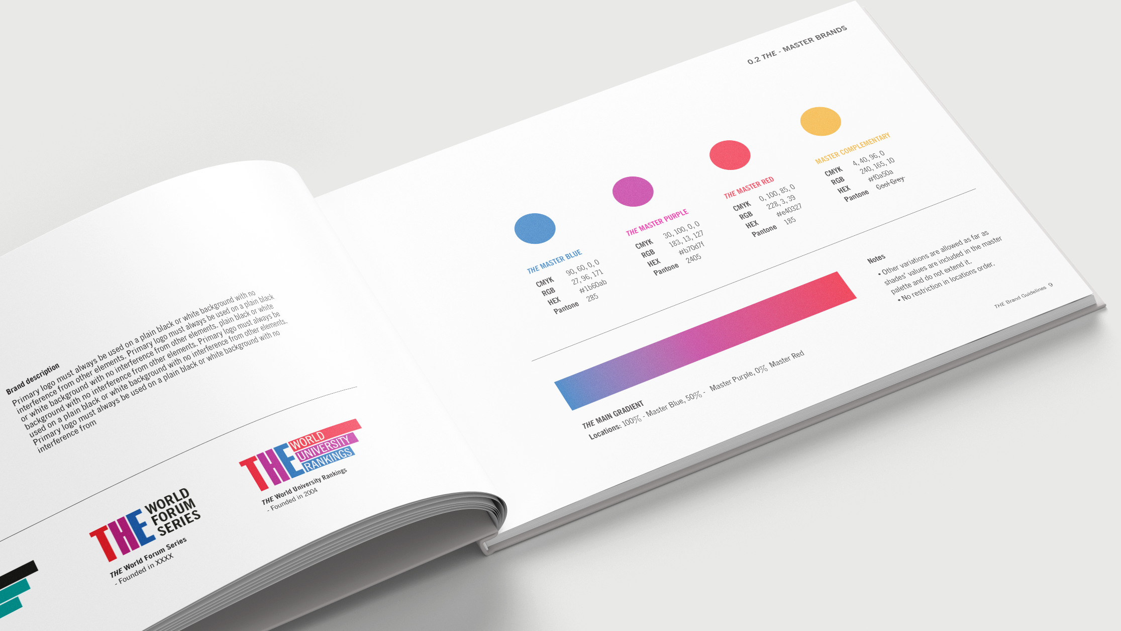
The goal was to refine the brand’s corporate design system, ensuring consistency while modernising its presence across digital and print platforms. Working closely with THE’s in-house design team, the project focused on establishing a structured, scalable system that would elevate the brand’s impact, reinforce credibility, and create a more recognisable visual identity. Central to this transformation was the introduction of the signature "key" gradient colour, a defining element that became the foundation of THE’s renewed brand aesthetic.
-
The redesign sought to balance tradition with modernity, maintaining THE’s established presence while introducing a more refined and flexible design system. The approach was centred on three key principles:
Clarity & Structure – A streamlined set of visual guidelines to maintain consistency across all touchpoints.
Recognition & Distinction – A bold yet sophisticated gradient colour system, reinforcing THE’s identity.
Scalability & Versatility – A system built for adaptability across editorial, digital, and corporate applications.
The introduction of the "key" gradient colour served as the foundation of the new system, injecting a dynamic and contemporary feel into the brand. By carefully calibrating hues, the gradient was designed to ensure high contrast and legibility, allowing seamless integration across typography, UI elements, and marketing materials.
Typography and layout structures were also refined to enhance hierarchy and readability, ensuring that brand communications remained clear and effective. The new system provided a framework that could evolve with the organisation, supporting future applications while maintaining a strong visual and conceptual link to THE’s legacy.
-
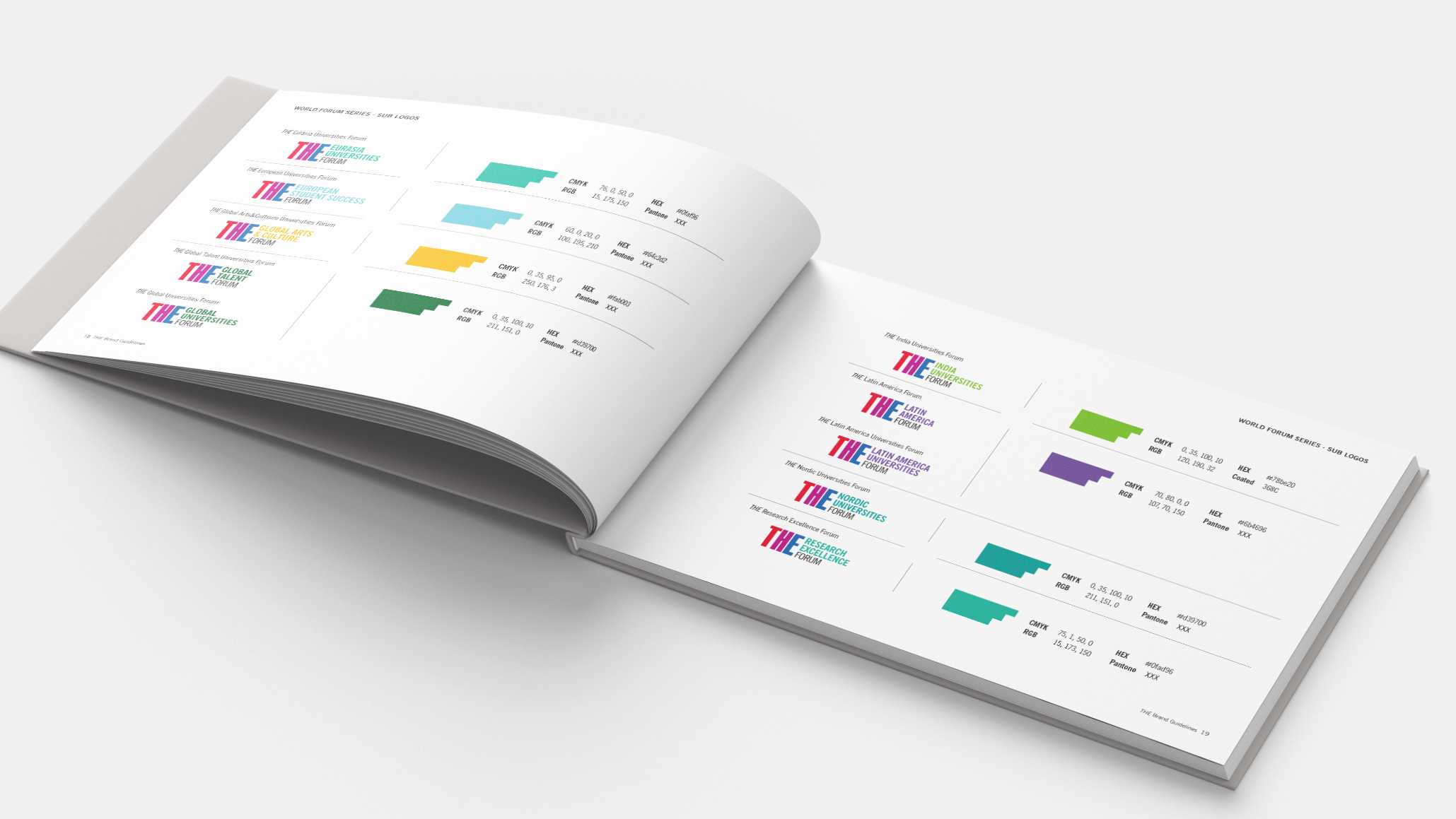
The updated brand guidelines established a cohesive design language that now extends across all THE materials, from corporate reports and digital interfaces to event branding and editorial content. The introduction of the "key" gradient colour has become a defining visual marker, strengthening brand recall and creating a more unified brand presence.
The new system enables greater design flexibility, allowing THE to scale its identity while maintaining consistency. The refined typography, structured layouts, and enhanced colour strategy ensure that every brand touchpoint—whether online or in print—feels both modern and authoritative.
This brand evolution positions THE for the future, reinforcing its status as a leader in higher education publishing while ensuring that its visual identity remains as influential as its rankings.


