• Brand Identity
CLIENT
Gavala & Co consultancy
TYPE
BRAND IDENTITY
LOGO DESIGN
VISUAL STORYTELLING
Gavala & Co
A luxury identity that merges traditional craftsmanship with modern digital design
Gavala & Co is a specialised boutique consultancy, offering Investment and Strategic Marketing advisory services to new and existing Glamping & Alternative Tourism operators, while also consulting governmental and industry-level Glamping organisations worldwide. The consultancy positions itself as a curator of transformative travel experiences, where luxury is not defined by opulence, but by the richness of authenticity, the art of restoration, and the value of connection. By adopting kintsugi as its guiding philosophy, the company emphasizes that true beauty lies in embracing imperfections and crafting something extraordinary from them - just as destinations, communities, and ecosystems can be elevated through mindful, intentional tourism.
The project is a creative exploration of texture, form, and storytelling, blending the artistry of pottery with the unique landscape of Greece, particularly inspired by the Milos Island coastline. Read below to explore the creative process and discover how we brought this identity to life - blending handcrafted artistry, the raw beauty of Milos Island, and modern digital design.
AT A GLANCE
-
Gavala & Co required a luxury brand identity that would reflect its philosophy of restoration, authenticity, and transformative travel experiences. The challenge was to create a visual system that seamlessly merged traditional craftsmanship with modern digital design, resonating with both high-end clientele and industry stakeholders.
The design needed to feel tactile and human, moving away from corporate sterility while ensuring consistency across multiple touchpoints. Balancing the raw imperfection of handmade artistry with the refined elegance of contemporary branding required a carefully considered approach. Additionally, the project was executed with a distributed creative team, requiring seamless remote collaboration across disciplines, from pottery artisans to digital illustrators and designers.
-
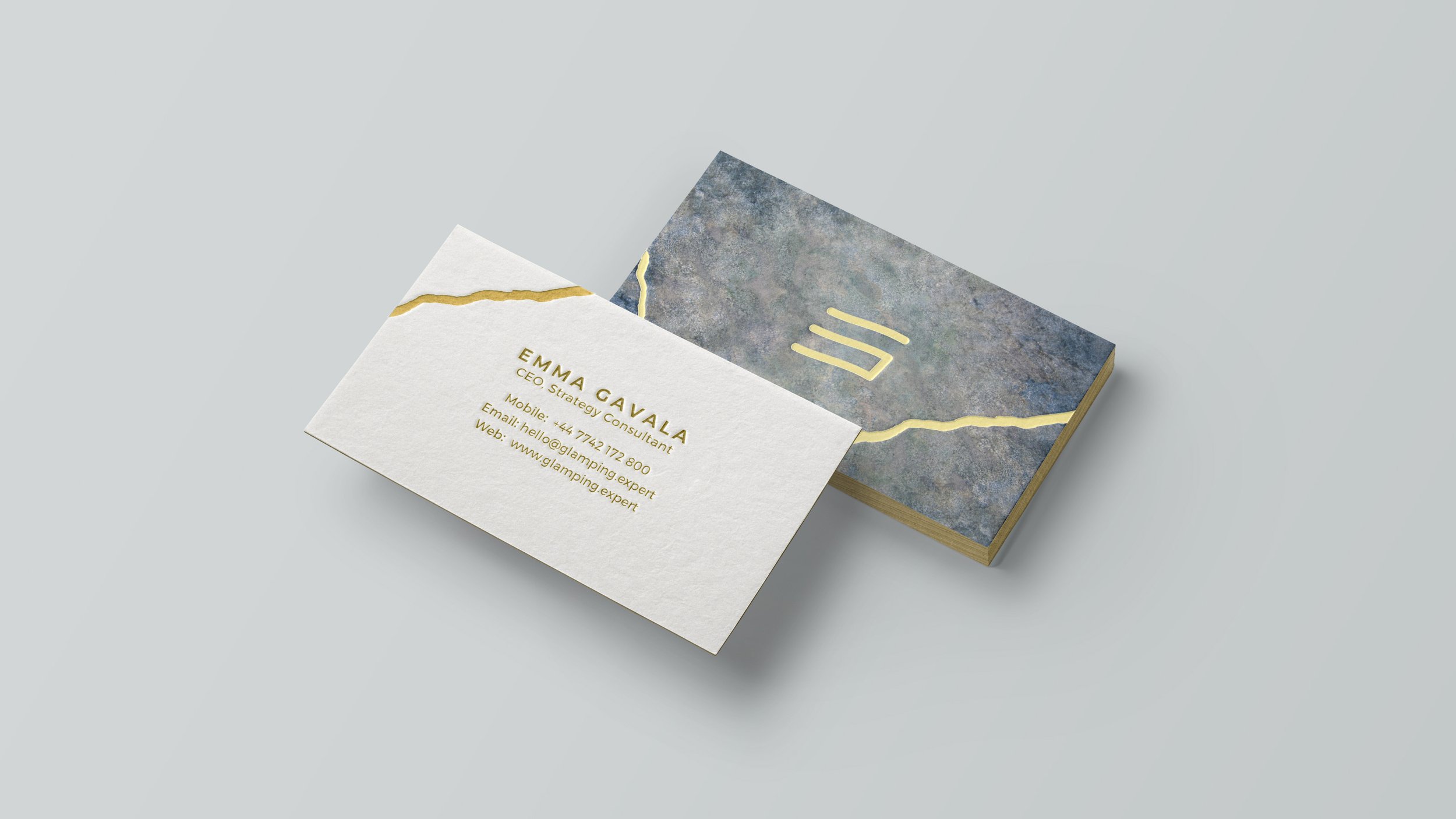
The identity for Gavala & Co seamlessly merges traditional craftsmanship with modern digital design, drawing inspiration from Kintsugi to create a brand that is both tactile and sophisticated. Handcrafted textures and organic forms were carefully translated into a scalable visual system, ensuring consistency across print, digital, and experiential applications.
By balancing raw, artisanal elements with refined typography and a timeless colour palette, the brand establishes Gavala & Co as a thought leader in alternative tourism. The result is a distinctive luxury identity that embodies authenticity, connection, and restoration—a brand experience designed not just to be seen, but felt.
THE PROCESS
01 | Crafting the brand’s identity texture
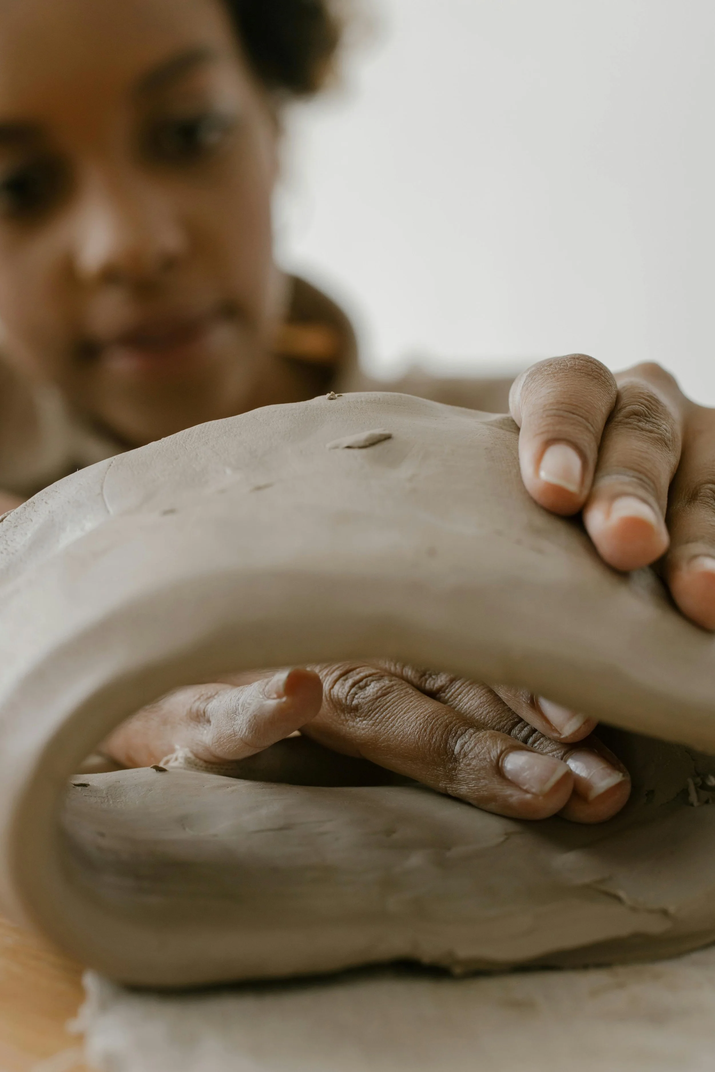
At the heart of this project lies a deep collaboration with a skilled pottery artist, whose expertise brought the brand’s vision to life.
Inspired by the flowing rock formations and chalky textures of Milos Island, the creative vision called for handcrafted ceramic plates that would reflect the natural beauty of the coastline. The design brief emphasized organic forms, muted tones, and a tactile surface reminiscent of the island’s rugged landscape, paired with the philosophy of Kintsugi to embrace imperfections as a design element.
To bring this vision to life, Pelas shaped and textured clay to replicate the undulating contours of nature. The plates were baked to enhance the tonal variations and depth, creating a visual language of raw elegance. One plate stood out—a unique blend of indigo and earthy hues with subtle textures that perfectly captured the brand’s narrative. This piece was digitized and integrated into the design system, forming the foundation for branding materials that exude authenticity and natural beauty. The result was a seamless fusion of artistic craftsmanship and creative direction.
02 | Logo development
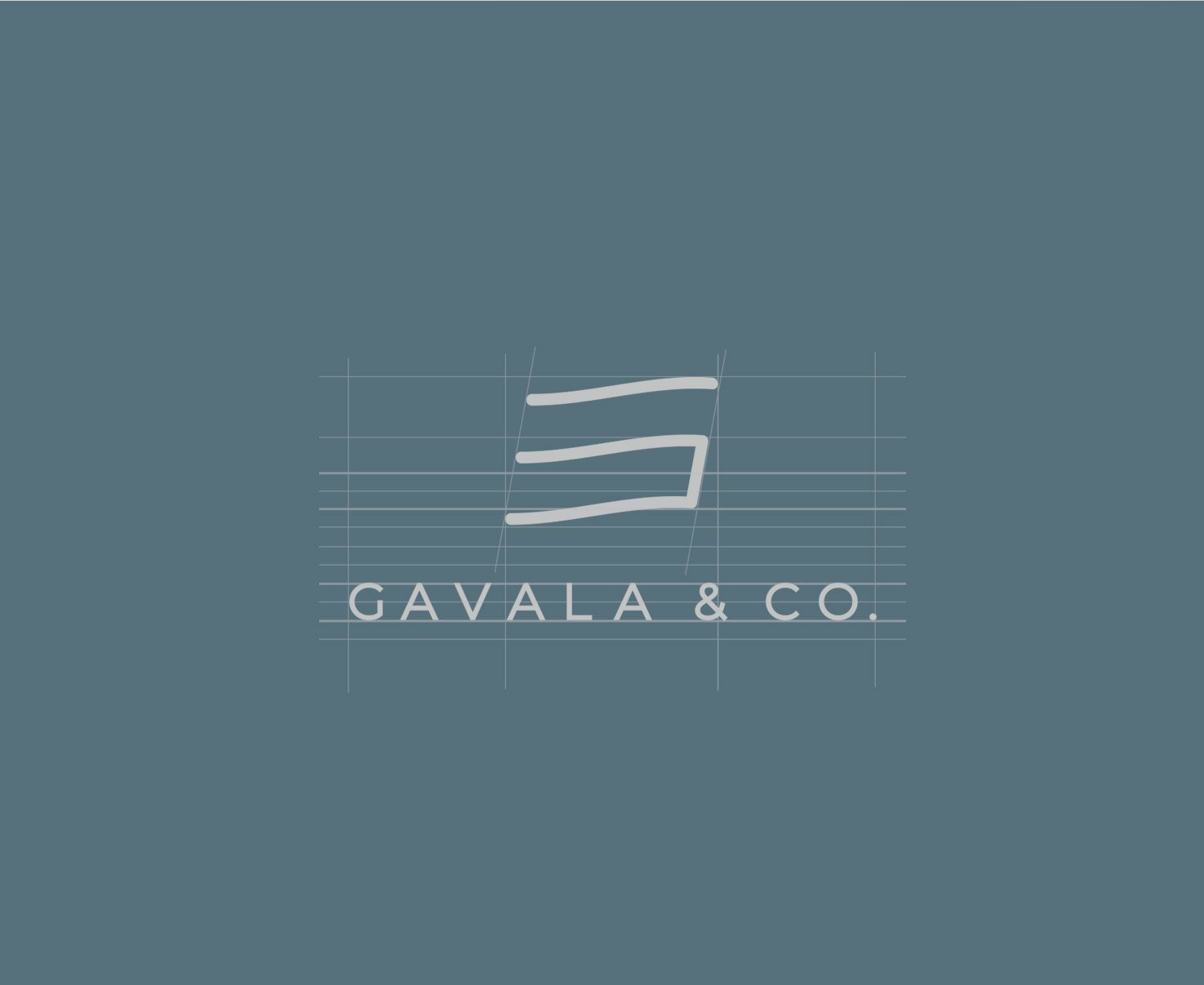
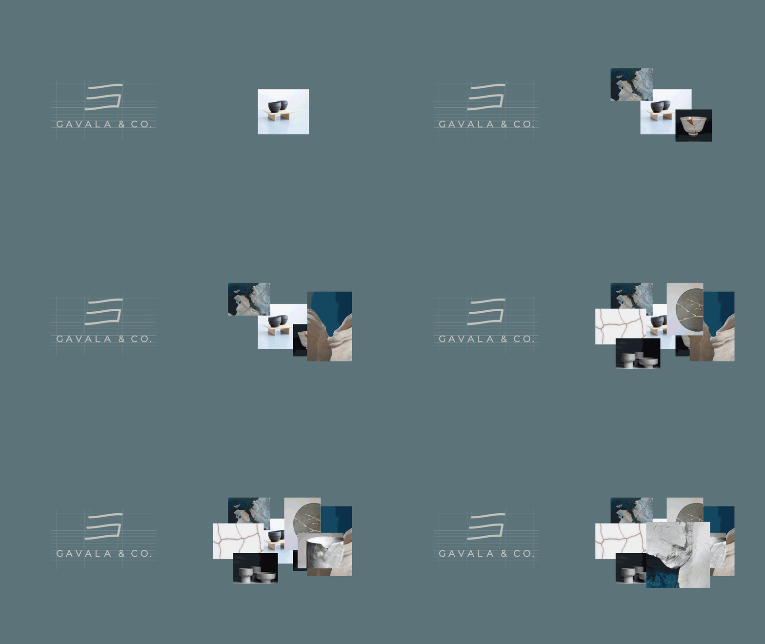
The Gavala & Co logo was designed as a refined interplay between the owner’s initials, E and G, subtly woven into a form that echoes the fluidity of Japanese ideograms. This approach not only nods to the brand’s inspiration from Kintsugi but also reflects the organic flows and natural paths found in landscapes shaped by time and transformation. The result is a mark that feels both intentional and effortless, embodying the philosophy of restoration, authenticity, and harmony with nature that defines the brand.
