• Event Branding and motion graphics
CLIENT
Greek Energy Forum
SERVICES
EVENT IDENTITY
MOTION GRAPHICS
CORPORATE DESIGN
Greek Energy Awards 2018
Developing a dynamic brand identity that embodies the flow and vitality of diverse energy sources.
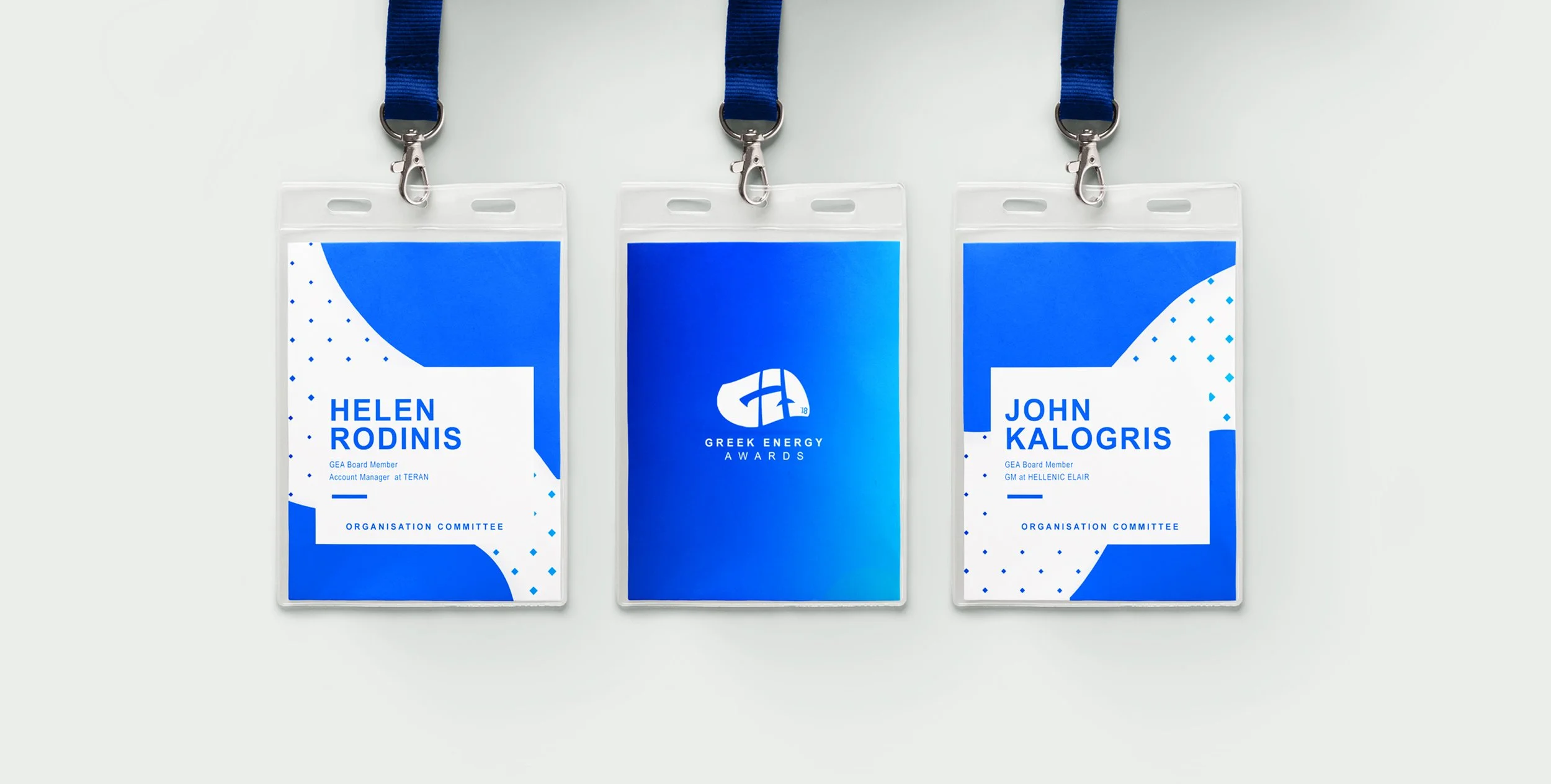
The Greek Energy Awards (GEA) 2018, hosted by the Greek Energy Forum, took place at Cass Business School in London. The event required a distinctive brand identity to establish its own presence independently from its host. The objective was to create a fresh and contemporary visual system that captured the movement, strength, and vitality of energy, making an industry that often feels distant more engaging and accessible.
-
The identity was built around the concept of continuous transformation, mirroring the ever-evolving energy sector. The foundation of the brand was a motion-inspired pattern, derived from the event’s video transitions, which became the dominant visual element across all materials. This approach introduced a sense of fluidity and dynamism while maintaining a structured corporate aesthetic.
Beyond aesthetics, the brand identity also aimed to bridge the gap between the corporate nature of the industry and a more inviting, engaging experience. By integrating bold design elements with a human-centered approach, the branding made the event feel less like a formal gathering and more like an exciting, interactive experience.
-
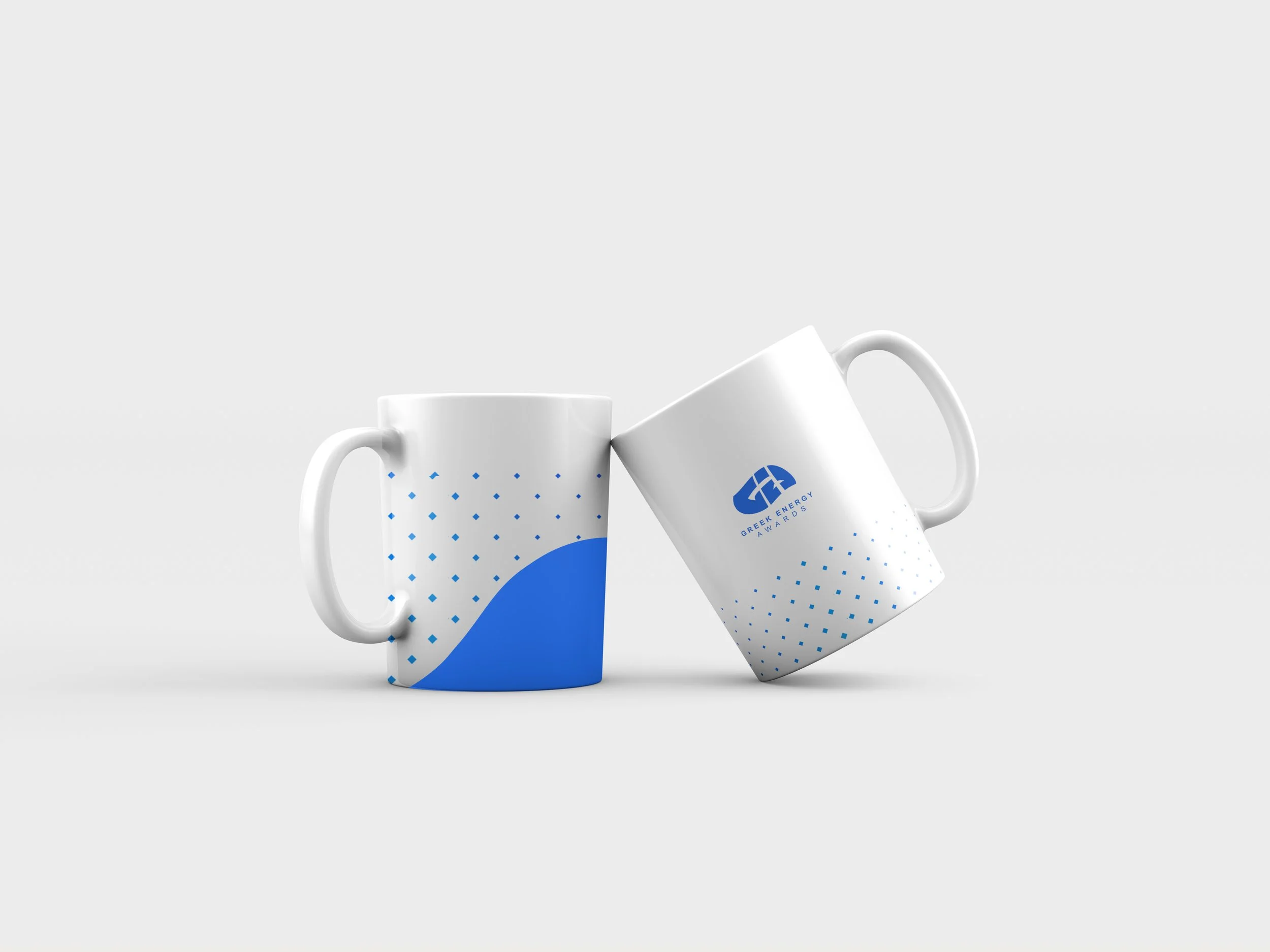
The brand identity was applied across a range of digital and print materials, ensuring a seamless experience throughout the event. The motion-inspired pattern became a key visual element, reinforcing the event’s themes through signage, presentations, event collateral, and marketing materials. The dynamic, fluid visuals complemented the structured typography and color palette, creating a balance between energy and professionalism.
-
The reimagined branding successfully established the Greek Energy Awards as a standalone event, distinct from its parent organization. The design brought a sense of energy, warmth, and movement to a traditionally formal industry, effectively solving the energy paradox-making the industry feel less distant and more human. By creating a recognizable, engaging, and flexible brand system, the event’s identity set a new standard for its future editions.
THE PROCESS
01| Logo development
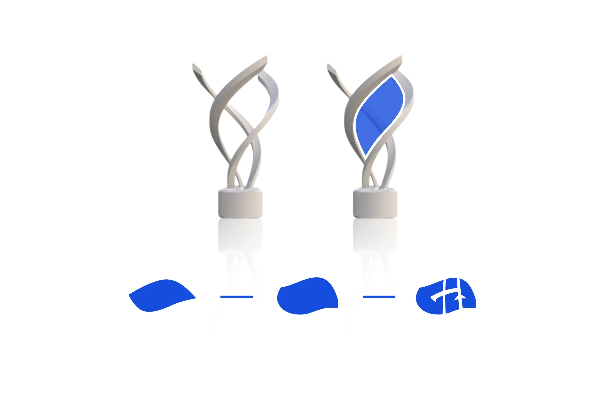
The design process began with an exploration of the event's core themes—energy flow and dynamism. The logo was crafted by abstracting the negative space of the actual award statue, resulting in a unique and memorable mark. To further enhance the brand's visual language, a dynamic pattern was developed, inspired by the event's video transition effects, symbolizing the continuous movement and transformation within the energy sector.
02 | Pattern development
The brand’s key visual element emerged from the event’s motion graphics, where a video transition effect was deconstructed and transformed into a dynamic, abstract pattern. This pattern captured the concept of continuous energy flow, visually representing movement, transformation, and progress—core themes of the Greek Energy Awards. By integrating this design across event materials, from print to digital applications, the pattern became a recognizable signature of the brand, reinforcing the idea that energy is in constant evolution. This approach not only brought cohesion to the visual system but also added a sense of dynamism a


