• Event Branding
CLIENT
J.P.Morgan Asset Management
AGENCY
Leap
SERVICES
EVENT BRANDING
VISUAL IDENTITY
DESIGN SYSTEMS
GUIDELINES
ART DIRECTION
Global Sales Conference
Crafting a bold, cohesive visual identity to define a new era of corporate branding.
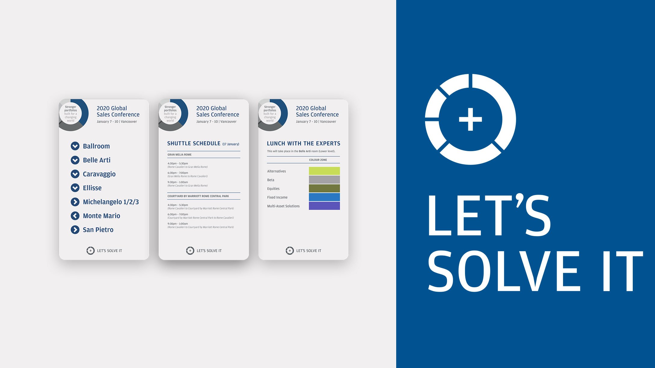
The Global Sales Conference 2020 was a landmark event for J.P. Morgan Asset Management, introducing a new visual identity that set the standard for all future corporate branding.
I worked closely with the Global Creative Director to refine and apply the newly developed brand system, ensuring consistency across event materials, presentations, and large-scale signage.
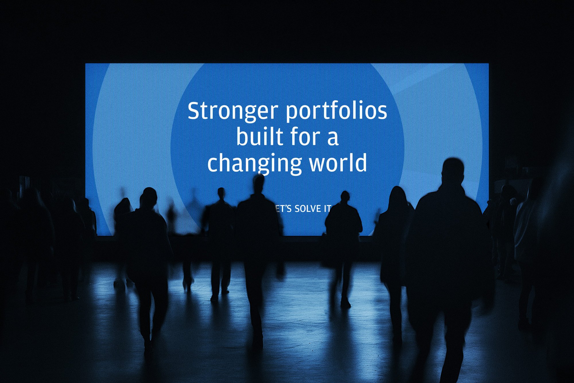
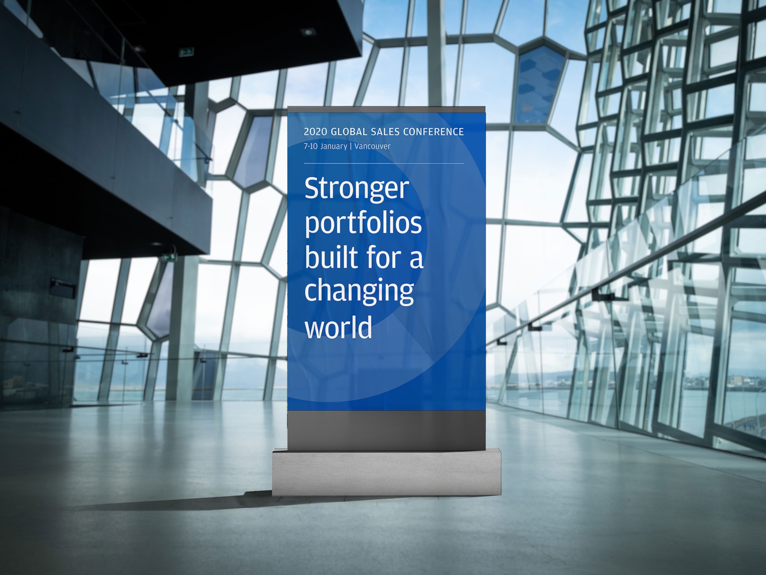
From stage design to printed collateral, I played a hands-on role in crafting a cohesive and immersive brand experience, evolving design guidelines and creating scalable visual assets that were both adaptable and impactful.
-
With the firm’s rebrand launching at the Global Sales Conference, the event needed to be a bold, unmistakable representation of the new identity. However, applying a fresh visual system at this scale required refining guidelines, typography, layout principles, and design hierarchy to work seamlessly across diverse formats.
The challenge was not only to execute the rebrand but also to push the creative expression within corporate design constraints - ensuring the event felt elevated, visually dynamic, and engaging for stakeholders.
-
My approach focused on ensuring the new brand identity translated cohesively across all event assets, from large-scale signage to presentation templates and print materials.
Refining the brand system: The initial guidelines were broad but required practical adaptations for event design, balancing structure with flexibility.
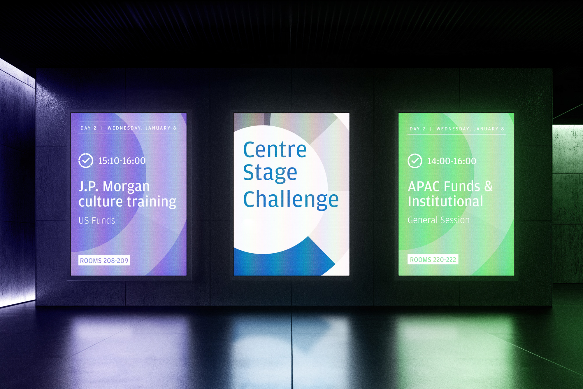
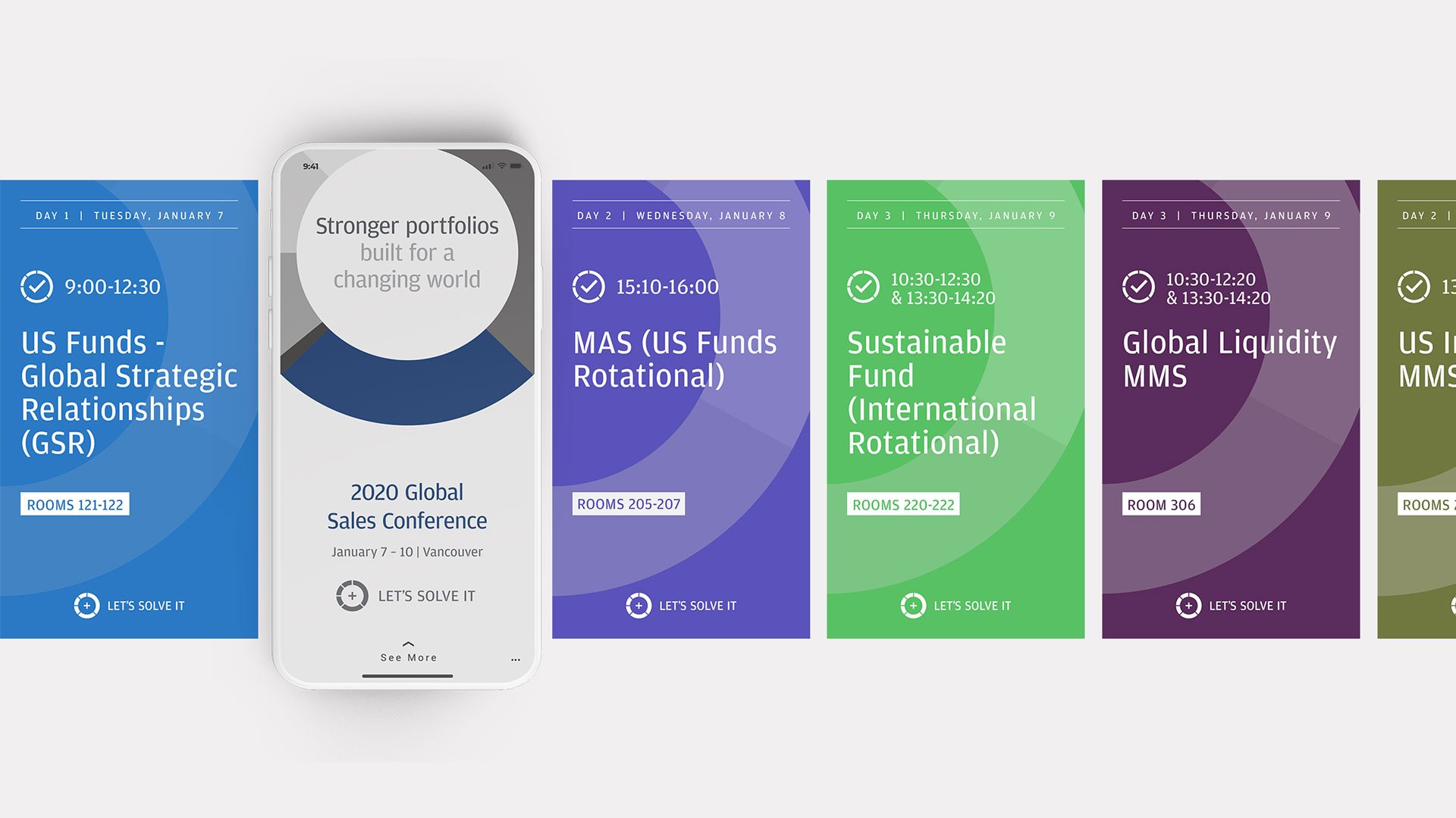
Creating scalable visuals: I developed modular design elements that could be used seamlessly across digital and physical touchpoints, maintaining a strong visual identity.
Designing for impact: The event needed to impress in a high-profile setting, so I focused on bold layouts, refined typography, and strategic use of colour and hierarchy to reinforce the brand’s new direction.
-
As Lead Designer, I played a pivotal role in shaping and executing the visual identity for the event. My hands-on contributions included:
Art direction & application: Refining and applying the new brand guidelines to event-specific materials.
Visual system development: Creating scalable, adaptable assets for a variety of formats, from large-scale stage design to digital presentations.
Guideline evolution: Testing and evolving the design system in real-world applications to ensure clarity and consistency.
Collaboration with vendors: Working closely with printers, production teams, and digital specialists to bring the visuals to life at scale.
-
The Global Sales Conference established a new visual benchmark for corporate events within the firm. The refined design system and cohesive execution ensured that the rebrand was introduced in a bold, unified way, influencing all future corporate materials and event branding.
Cohesive brand execution: Ensured a seamless application of the rebrand across all event touchpoints.
Scalable design system: Developed versatile assets that were later used for other corporate initiatives.
Elevated event experience: Created a visually striking, high-impact environment that reinforced the firm’s new brand direction.
This project was a highly hands-on creative execution, demonstrating how art direction and design craftsmanship can shape a corporate identity at scale.
